Challenge
We receive thousands of phone calls to our call centers each month from our dental providers gathering simple patient benefit information; how can we get them to start going online instead of calling?
My Role
I was the lead researcher and designer on the project, managing everything from discovery research design, planning, and execution to design concepts. I partnered with another UX Designer for the facilitation of concept and usability testing since I was so close to the design and could be biased.
I also worked collaborated with the development team to flesh out some ideas once we understood limitations and constraints.
This project came at a time when UX was just starting to become a topic, so there was no process in place for what to do and how to do it. So a large part of my role was to also convince stakeholders to spend money to go out and talk to our users -- something we'd never done before.
Process
Ethnographic Field Study
The challenge was a big one, and before we could even begin to think about making updates to the website (it hadn't been touched in years) we had to take a step back to ask some questions.
Who are the users? Are the actual dentists calling us or is it the front desk receptionist? Or someone else?
What information are they calling for? Is is the same information every time or does it vary?
What's the barrier to using our website?
I pulled together a lot of different people to start to build a picture of what this "provider" audience looked like. It was a starting point, but all of this was based off of internal guesses and assumptions, so I suggested we go out to the field to watch our users work to observe their process and better understand how we could create something that would work for them.
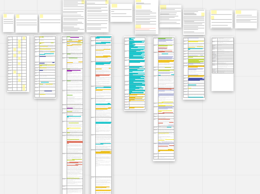
Two teams of two flew out to Phoenix to visit several dental office locations - we sat behind the front desk and watched them work, asking questions along the way. We observed things like the:
- tools they were using
- people they were interacting with
- terminology they were using
- sticky notes they had stuck to their monitors and desks
- binders of information they had sitting around
- waiting room set up
Through our observations, we learned that in the binder where they stored the log in credentials to the websites they worked with, they had physically crossed our website off the list; they weren't even trying to use our website anymore!
That was a huge insight and something we wouldn't have learned had we not gotten outside our building to talk to our users.

Personas
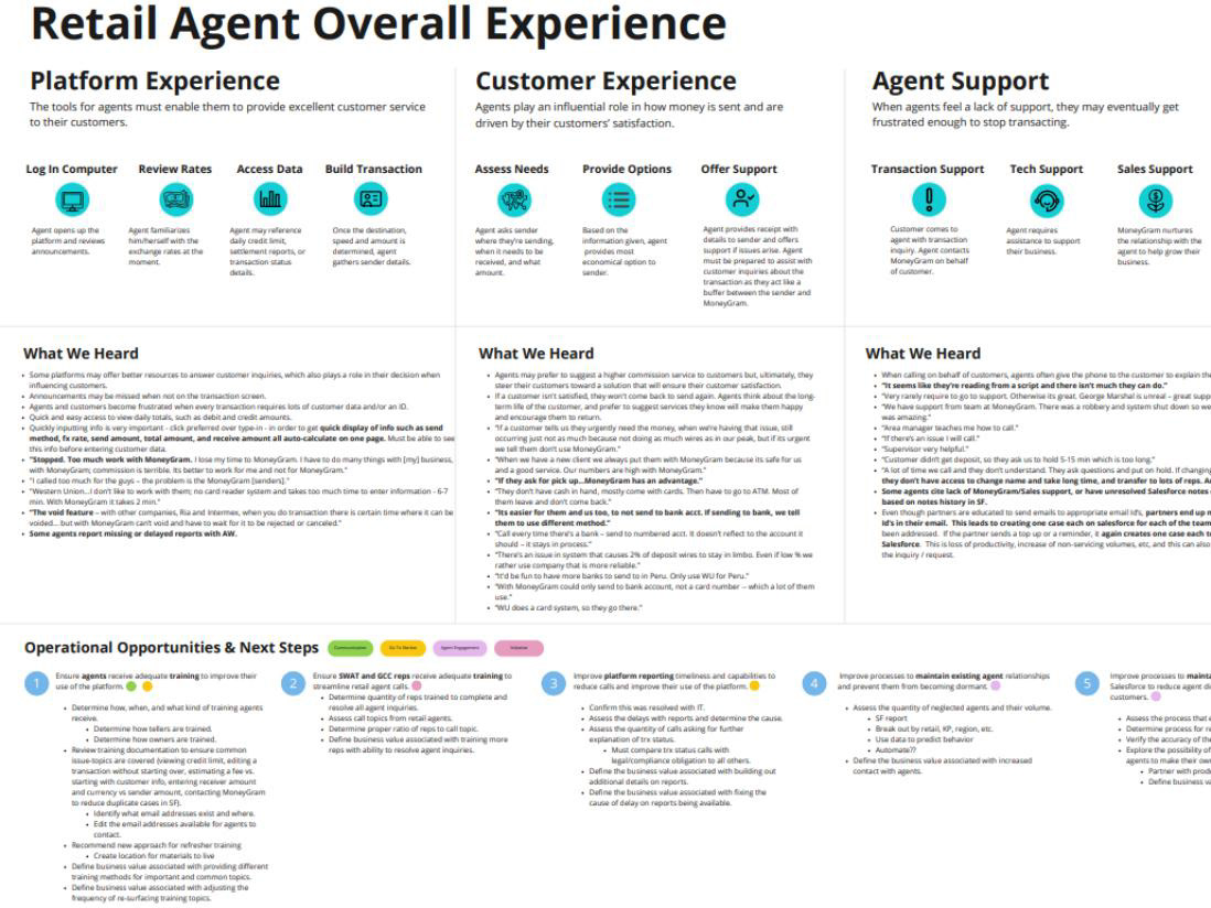
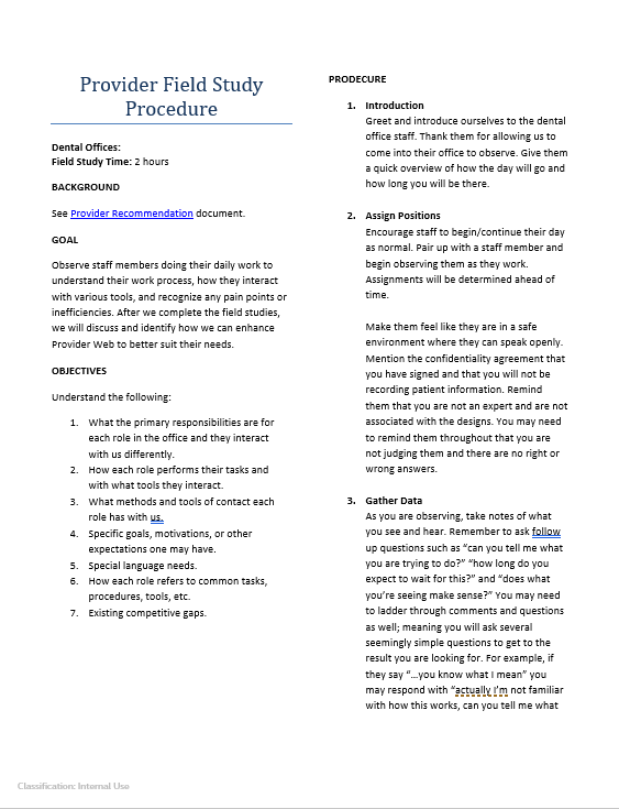
From going office to office, the research team started noticing different user types. They all had tasks and goals that made them interact with us either online or by calling, but the interactions varied slightly. I needed a good way to capture these things that we were learning, so my next step was to create personas.
I ended up with four different user types, with the biggest difference being their responsibilities and the things that motivated them.
The personas were shared with the development team and were used to guide our design questions throughout the process.
Concept Test
Once we knew enough about our users and what their needs and goals were, we were ready to work towards the original challenge.
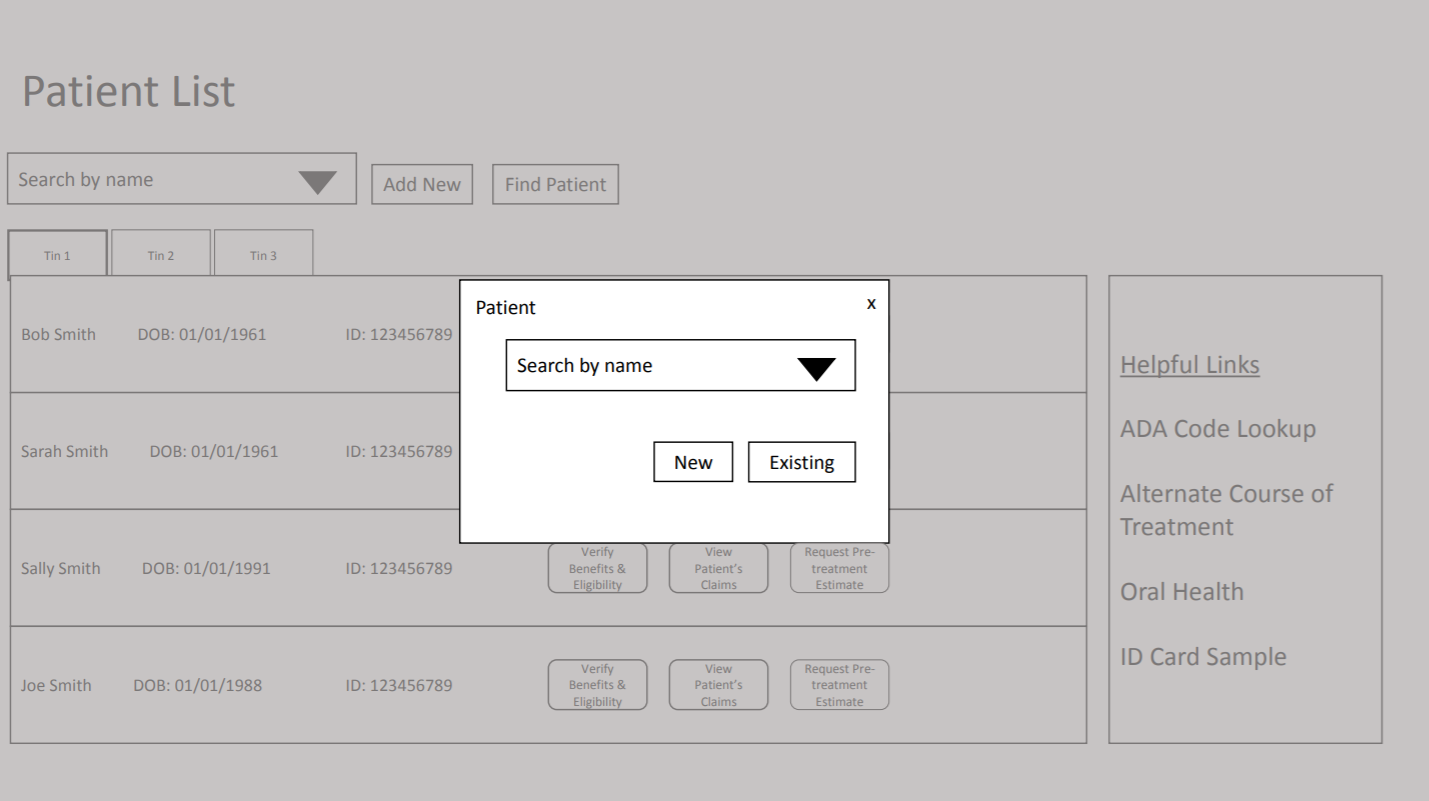
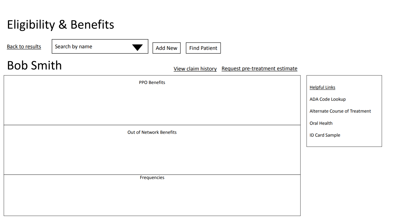
I used what we learned to start thinking through a new flow for getting patient information online; this included high level design concepts for top tasks - to see if we were headed in the right direction.
We took these design concepts on the road to test and learned even more about our users and how they work.
“You don't need a lot of fluff. I need information. I'm in and out. Every office is looking for the same thing.” - Susan, 30 years’ experience
“Patients get angry – ‘You told me it would be this much!’ The closer you get [to the actual cost], the happier they are.” - Gloria, 41 years in the dental industry
“On the website, you can [show] your patient 'Here's what I looked up for you and this is what your insurance company told me. It's like a backup.” - Stacey, 8 years as an Insurance Coordinator
Usability Test
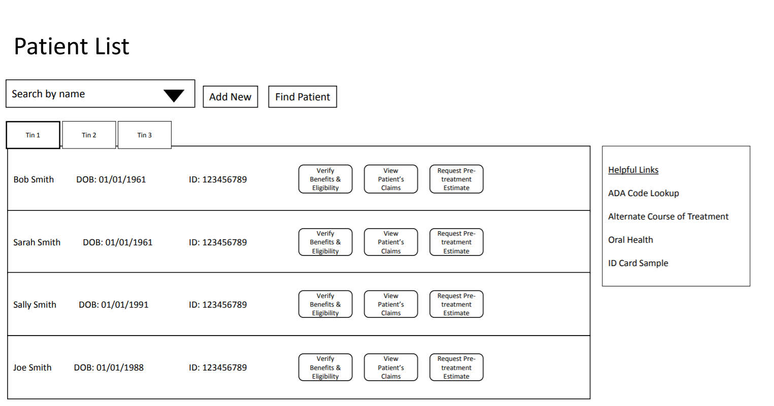
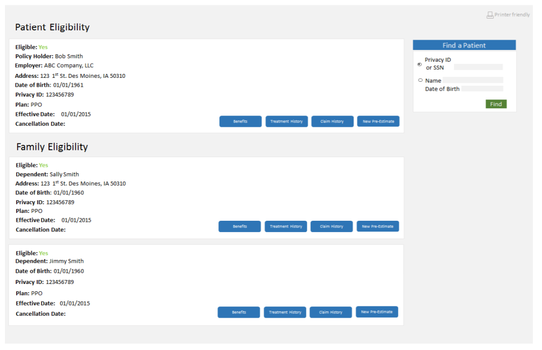
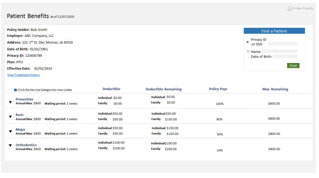
In the spirit of 'design, test, learn, and iterate' I continued to refine the design concept. After fleshing out the data we'd show for certain tasks, we tested the direction of the design again.
At this point, there still was not a development team associated to the project; I wanted to get the design to a point where concepts had been vetted, but I didn't want to squash the opportunity for developers' to provide ideas once they'd be ready to work on it.
I did another round of testing before partnering with the developers to flesh out the final design.
Outcome
Since going live, the project has seen a 27% increase in using the website to gather patient benefits.
There's also been a 7% decrease in phone calls across all dental provider interactions - which allows them to spend their time with more detailed phone calls instead of simple benefit calls.
